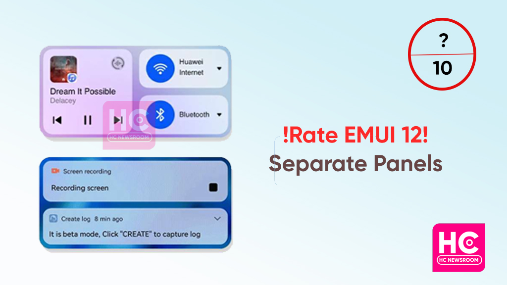
Do you like separate EMUI 12 notification panel and control panel?
The Huawei EMUI 12 software work to redesign your smartphone in an efficient way, not only in terms of the interface but also in features, optimization, and a new notification panel. And Huawei offers two separate panels one for the notification and another a control panel.
By creating a brand-new notification panel and control panel that is based on an in-depth study on user preferences and psychology. The interface has been split into two independent sections, which improves interactions and makes it easier to tell apart elements.
However, what do you think about a separate Notification panel and control panel in EMUI 12? What does new changes appear?
Before EMUI 12, the notification panel and control panel were initially integrated into a single panel. But after EMUI 12, when swiping down from the top of the screen reveals the notification panel and control panel but in a very different format.
The notification panel is accessed by swiping down from the left edge of the screen, while the control panel is accessed by swiping down from the right edge of the screen.

Why Huawei brought separate panels:
However, these revamp in the panel brought because Device+ and audio were added to control panels in EMUI 12. In addition to the existing shortcut switches. And after adding this above-mentioned shortcut, it’s difficult to have notification messages, shortcut switches, and Device+ all displayed onscreen.
To access them alternatively, you may have to slide or scroll the screen. You would probably assume that the pull-down interface is fragmented and difficult given the complexity of those activities. Even locating a shortcut switch would be extremely difficult.
To read alerts or access the control panel, simply swipe down on the left or right sides of the screen, respectively, when the notification panel and control panel are split into two separate displays. Using Device+, it is simple to enable or modify shortcut switches to suit your needs.
Additionally, the audio control panel is also very helpful having to launch and close numerous audio applications. The ability to switch between apps and choose a playback device is greatly facilitated by shortcut switches.
Meanwhile, for all these reasons, I personally think it a good idea to have to separate panel. Since EMUI 12 places such a high value on user intuition, there is also the Device+ function, which makes it possible to collaborate seamlessly across devices.
But it’s all about my opinion, what about yours? How much do you like the idea of a separate EMUI 12 notification and control panel out of 10 on the scale? Just don’t forget to share reviews with us.
Do you like a separate EMUI 12 notification panel and control panel? #huawei
— HC Newsroom (@HCNewsroom) September 30, 2022
If you want to send us Tips, Update Screenshots, or a Message? connect with us here:
- Screenshots@huaweicentral.com
- Tips@huaweicentral.com
- Message us on Twitter
The post Do you like separate EMUI 12 notification panel and control panel? appeared first on Huawei Central.
from Huawei Central https://ift.tt/RpovIWH
via IFTTT

Post a Comment